Still though, that's a long time to look for patterns and we should be able to find some time frame in which we recovered from a major low and are years into the recovery. Of all those periods, we should be able to find one that lines up well.
While there seemed to be several periods of time that lined up fairly well, there are really 2 candidates that I really liked that came off a major bottom. Unfortunately they are polar opposites. The one was 2002-2007. But the one that I think will shock some people is the period of
1920-1926
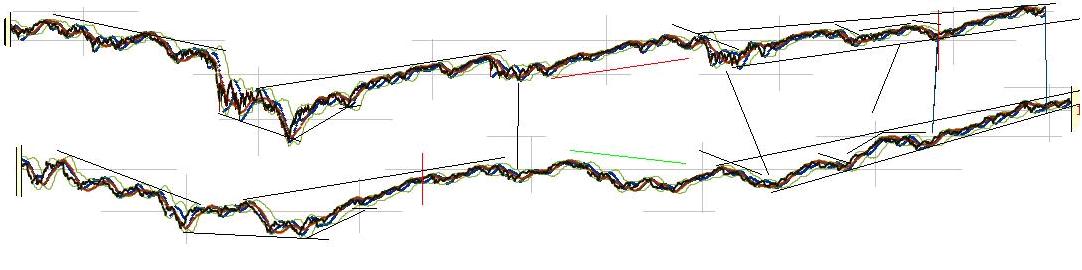
The last time I saw an analog line up like this was in 2009 near the bottom. We rallied from the low the expected 60% but actually kept going. Analogs only work so long.
I blogged about this way back. In fact, to access it we have to use the "way back" machine.
http://web.archive.org/web/20090108182333/http://www.ibankcoin.com/peanut_gallery/index.php/2008/11/17/historical-comparisons-part-1-now-vs-1929
Back then it was "now vs 1929" where 2007 lined up with 1929 top basically. Now it's now vs 1929 where mid way through 2015 or late 2015 lines up with 1929.
If this actually works going forward it is suggesting a huge bullish move as took place between 1927-1929. During that period, stocks went up around 150% depending on where you measure from exactly.
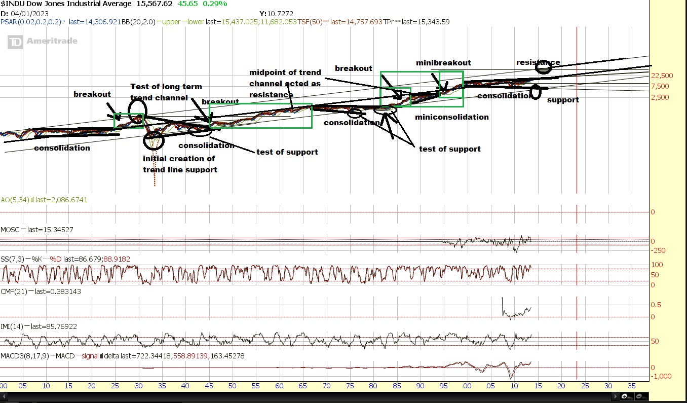
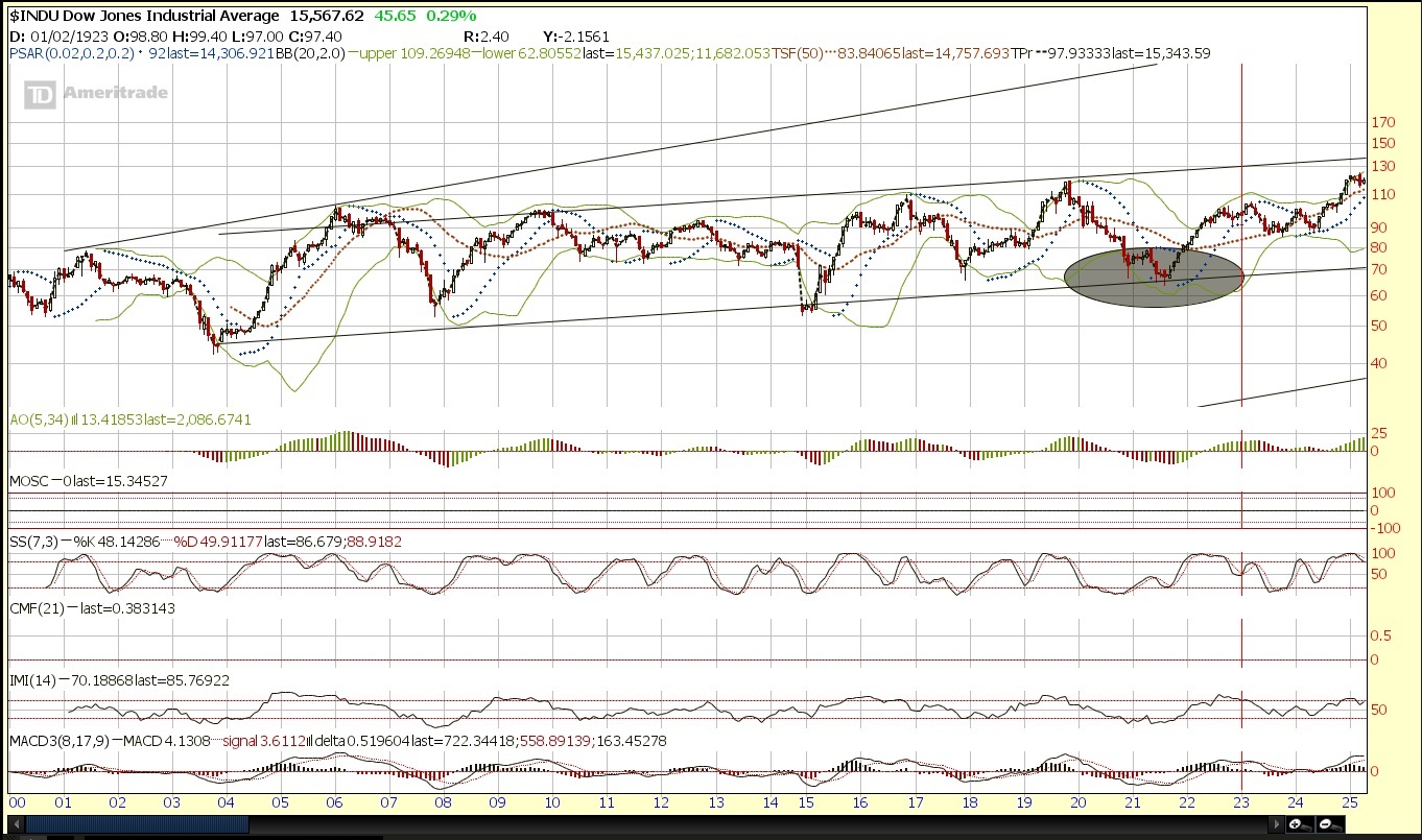
There are other ways to look at potential targets. However the big issue we still have to overcome is the long term trendline of the dow which puts resistance around the general range of 16,000.
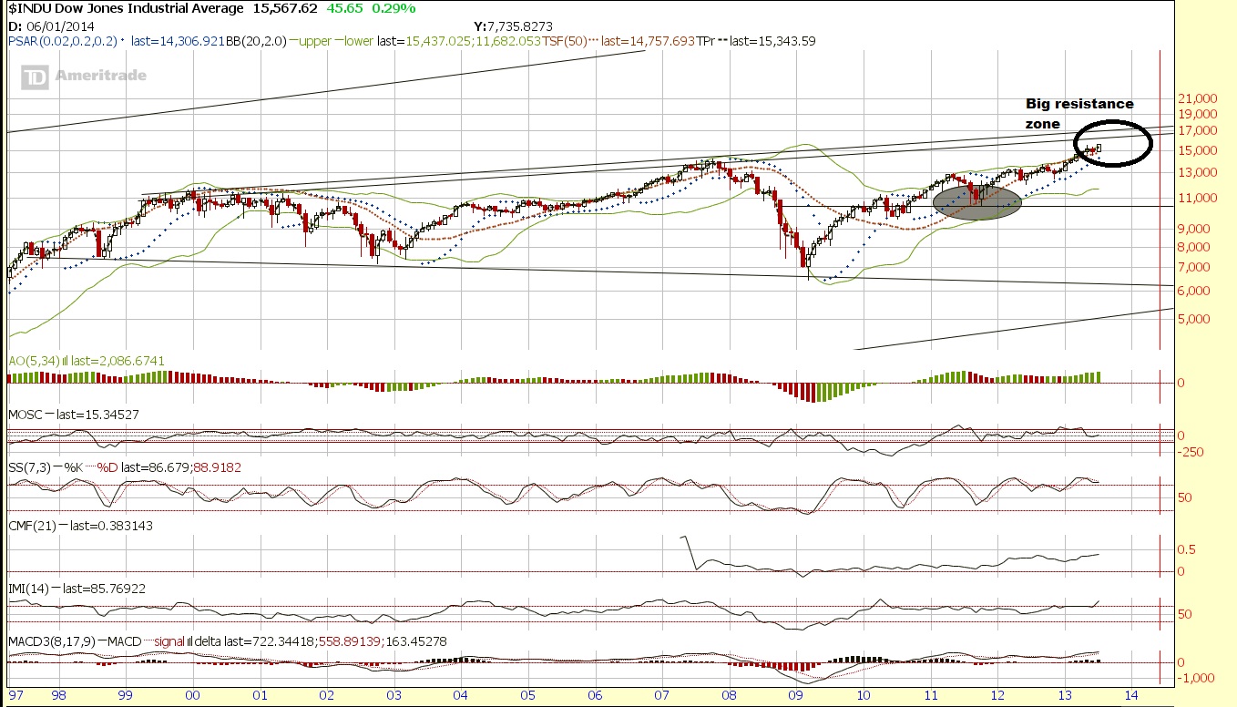
There is support around 13,000 and then 10,500 and then again at 7500 and very, very long term support at 6000 or so. The resistance kicks in around 16,000. After that? There is really no reference until around 40,000.
Ideally, we will get a sharp crash like similar to 1987, and perhaps an even greater crash in other parts of the world, which could set the stage for a monster parabolic run. Although the opposite side of that perhaps would not be so healthy.
Here is japan
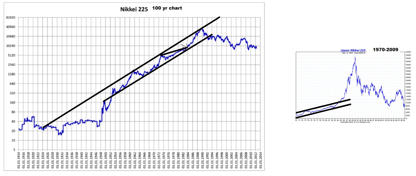
You probably more often see the chart on the right dating back from 1970 leading to 1989. But look at the chart on the left that truely offers a long enough historical comparison for us to see that 1989 could really just be perceived as a test of very long term resistance on a trend-line.
Here is another market. First the chart you are probably used to seeing.
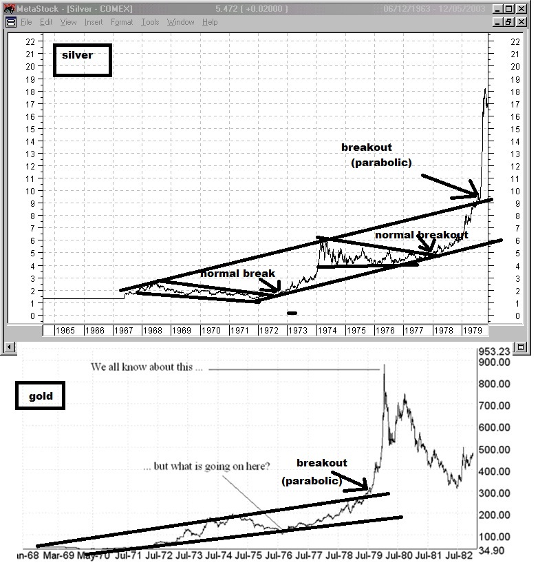
Next, a much greater historical context of data.
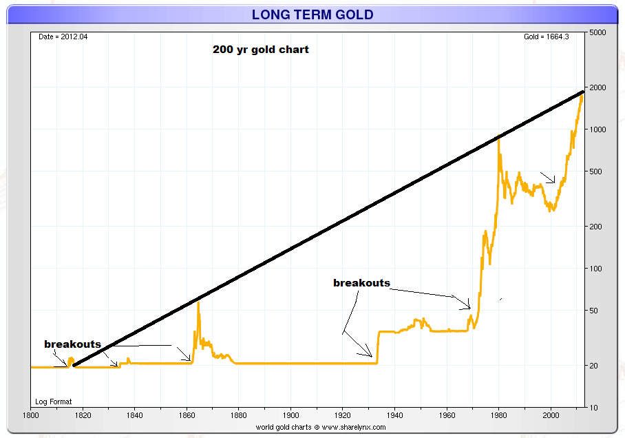
So gold at 1900 actually was actually just a test of resistance. I think the data derived from understanding the total global "allocation" weighting towards each asset class at a given time and factoring in supply would be much better to measure with regards to bubbles to know just how extreme these moves get by asset class. Bubble's "end" when either the credit can no longer expand at the same rate or the allocation weighting cannot shift anymore aggressively towards that asset without completely neglecting and providing ridiculous valuations and opportunity elsewhere. The bubble peaks when buying power cannot sustain the prices and the slightest amount of selling pressure and all the volume that came in towards the end buying "at any price" suddenly end up underwater and want to sell. Everyone who wants to buy already has done so and the price can go nowhere else but down.
But nature of bubble's aside, All asset classes can act like that since price is a function of confidence and perception of return relative to all other opportunities.
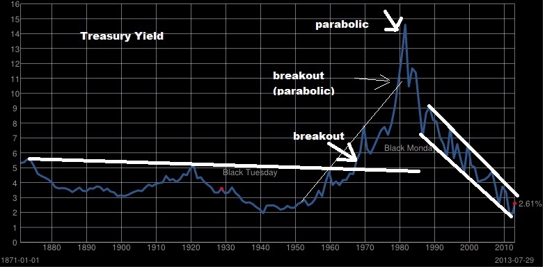
Yields went parabolic even. But the time in which yields went parabolic at the end was measured in decades, rather than years. The time frame of such a cycle is much different than stocks or gold.
We have three great examples of stocks going parabolic. The roaring 20s, the Nikkei bubble into 1989, and the nasdaq bubble into 2000.
ou can see
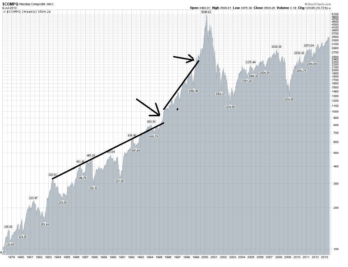
You can see that as a trendline is broken, and it doubles, if during that double it breaks another trendline, the time in which it doubles is significantly less. Actually the move into 1984 was a slight break of the previous trend and after the pullback it basically doubled from 300 to 600 in 8 years first. Then 800 in 1994 to 1600 in 1998 4 years. Then 1999 to 2000 from under 2500 to over 5000 in 1 and a half years.
When the major break of the trendline is made, the asset often accelerates to it's peak. In the extreme example like the Nikkei or nasdaq we see it double and then double again.
Perhaps if/when we break the long term resistance it will instead be a "secular" run. Afterall, as I have shown, the returns are possible to continue measured over a long period of time. I am not yet convinced we won't see a significant pullback first, and we are coming up on the period of time August-October that worries me.
However, the actual very long term resistance probably will still hold, so it's a question of whether we set up a quick run to extreme historical highs (1929), or a gradual run to large gains over decades (1942-1965, 1982-2000). You could measure from trough to peak, or you could measure from the distance after the breakouts. I have done this in historical look from 1900-2013.
From “breakout” point (This has YET to happen)
1924-1929 104 to 386.1 A 271.25% Gain
1951-1966 235 to 1001.1 A 326% Gain
1983 to 2000 1100 to 11750.25 A 968.20% Gain
(ALTERNATE: 1983 to 1987 1100 to 2746.70 A 149.70% Gain)
(1995 to 2000 4000 to 11750.25 A 193.76% Gain)
You can add onto that the parabolic runs of the nasdaq, and the nikkei with minor considerations and even look at a few of gold's historic runs to get an even more bullish target.
I think ultimately if you think the market is going "parabolic" the very long term upper trend channel that I outlined is the target, which is around 40,000. I think history shows that if you break the long term trend channel, you can see stocks double in only a few years such as in the nasdaq or Nikkei's final run up. Actually, in both cases they basically quadrupled in around 4 years.
Then there is the dow in the roaring 20s. Before it broke the long term resistance lets see what it looked like first.
Compare that to the dow right now.
and now afterwards what did the roaring 20s look like?
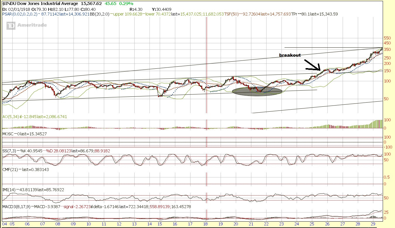
It put in about a 150% gain in 4 years. Where does 150% gain from the breakout point of around 16000 take us? You got it, 40,000.
Let's look at other famous bubbles just for fun...
http://myweb.rollins.edu/jsiry/south-seas-bubble.jpg
http://timiacono.com/wp-content/uploads/11-01-27_newton.png
http://www.thebubblebubble.com/wp-content/uploads/2012/06/mississippi-stock-chart.jpg
http://origin-ars.els-cdn.com/content/image/1-s2.0-S0304405X12002541-gr1.jpg
 http://www.sciencedirect.com/science/article/pii/S0304405X12002541
The money exists in the system to take us there too. Just look at some numbers.
backup images


So Resistance is 40,000 long term and we could easily hit that. The nasdaq type of run could take us there too.

No comments:
Post a Comment